01 · Lost in the scroll
People scrolled up and down the long page, looking for the next step.
Case study 02 · NatureLand · Checkout
Problem
81 of every 100 shoppers who reached checkout never tapped Pay.
Approach
Pay-button events showed where they dropped. Session recordings showed why — so I rebuilt checkout around how people decide.
Result
Almost twice as many shoppers reached Pay, and errors at Pay fell 78%.

19 → 36
shoppers who tapped Pay
Per 100 shoppers at checkout, before and after release
+89%
more shoppers reached Pay
Relative change from 19 to 36 per 100
−78%
errors at Pay
Taps on Pay before the required details were complete
2 steps
instead of one long page
Delivery first, then payment
01 · The problem, Context · Empathize · Define
A Natureland order can split into several parcels, and each parcel has its own delivery options. The old checkout put everything on one long page: items, delivery for every parcel, summary, coupon and payment. The button at the bottom changed its label to whatever was still missing.
19 of 100
shoppers who reached checkout tapped Pay
Before the redesign
74%
of Pay taps ended in a successful payment
14 of 19
~3 screens
of scrolling before Pay
One long page
81 of every 100 shoppers who reached checkout never tapped Pay. That was the biggest loss, so that is where I looked first.
Steps 3 to 6 are where checkout broke: the page asked for decisions people could not see.
People scrolled up and down the long page, looking for the next step.
Each parcel needed its own delivery choice. With two or more parcels, people picked one and thought they were done.
Knet was selected by default. Anyone paying another way had to hunt for the payment section at the bottom.
A small “I have a coupon” link sat under the summary. People with a code had to look for it.
02 · The approach, Empathize · Define · Ideate
I used two sources together. An event on the Pay button told us how many people tried to pay. Microsoft Clarity recordings and heatmaps showed what they did before that. Then I traced every pattern to the way people make decisions.
How might we show only the decisions that matter at each moment, so no parcel is left without delivery?
How might we make the payment method and savings easy to find and confirm, right before people pay?
| Observed | What was happening | Principle |
|---|---|---|
| Lost in the scroll | Every decision sat on one surface, so people had to hold too much in mind at once. | Cognitive load · Hick’s law |
| Delivery missed for a parcel | The options for a parcel were far from the next parcel and out of view. | Proximity · Visibility of status |
| Searching for payment | A preselected Knet looked like a decision already made. | Default effect · Status quo bias |
| Coupon not found | A small link at the end of a long page has very low salience. | Salience · Serial position |
| Pay tapped too early | The button let people act before the order was ready. | Error prevention |
I judged each option by how many of the four observed problems it solved.
Option A
Clearer section titles and a sticky summary. Cheap, but the page stays long and parcel choices stay far apart.
Solves 1 of 4
Option B
Scroll to the missing field when Pay is tapped. Catches errors, but only after people fail.
Solves 1 of 4
Option C
Step 1: address and delivery for each parcel, with the cost so far. Step 2: coupon, points, wallet and payment method.
Chosen · solves 4 of 4
03 · What we did, Prototype
Same content, new order. Each screen asks for one kind of decision, and the button moves forward only when that decision is made.
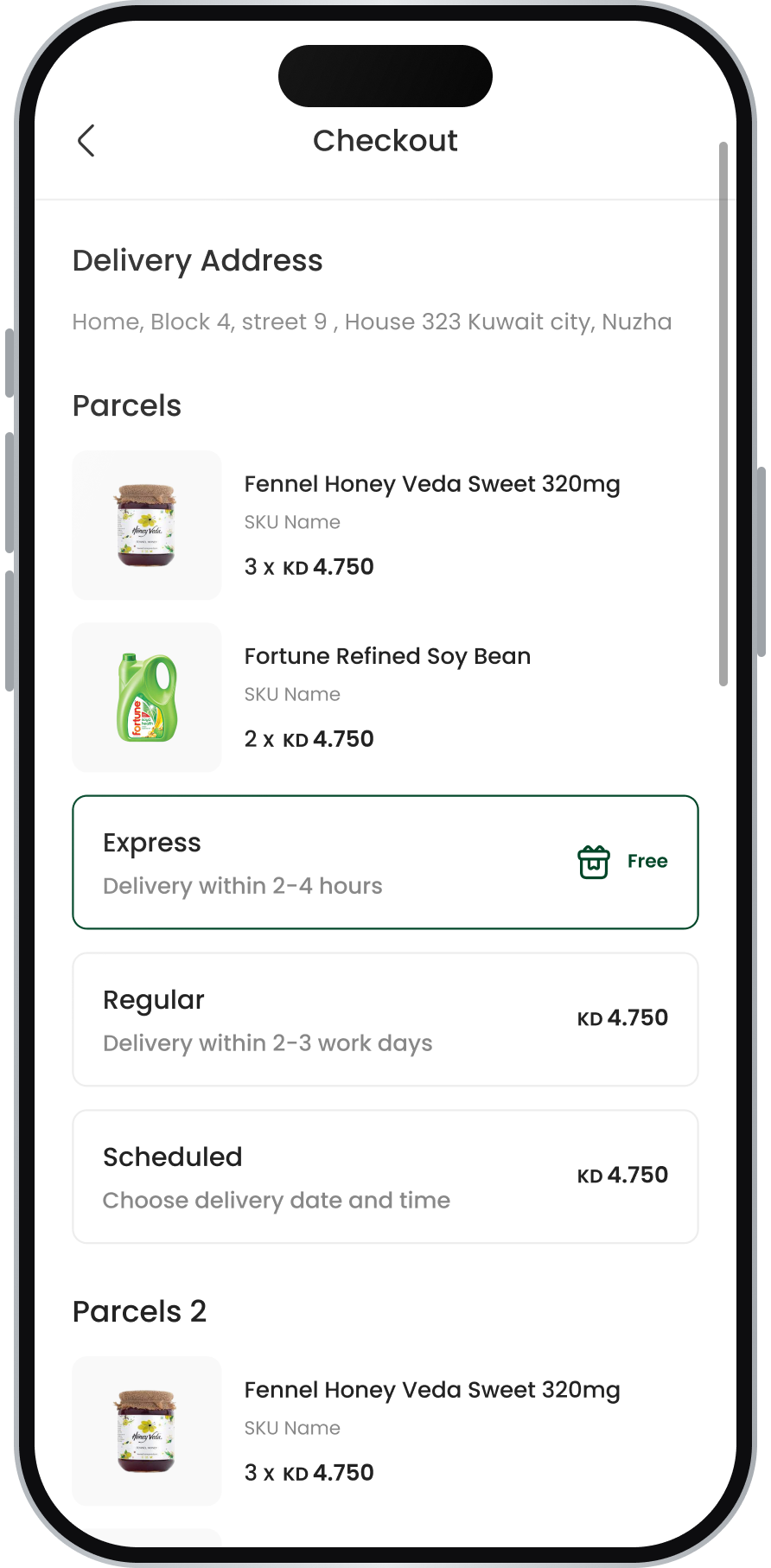
about 3.2 screens of scroll
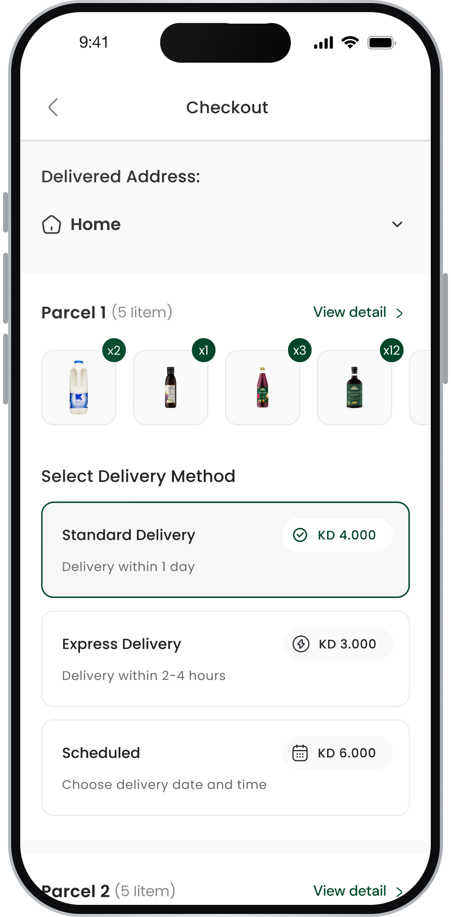
about 2 screens
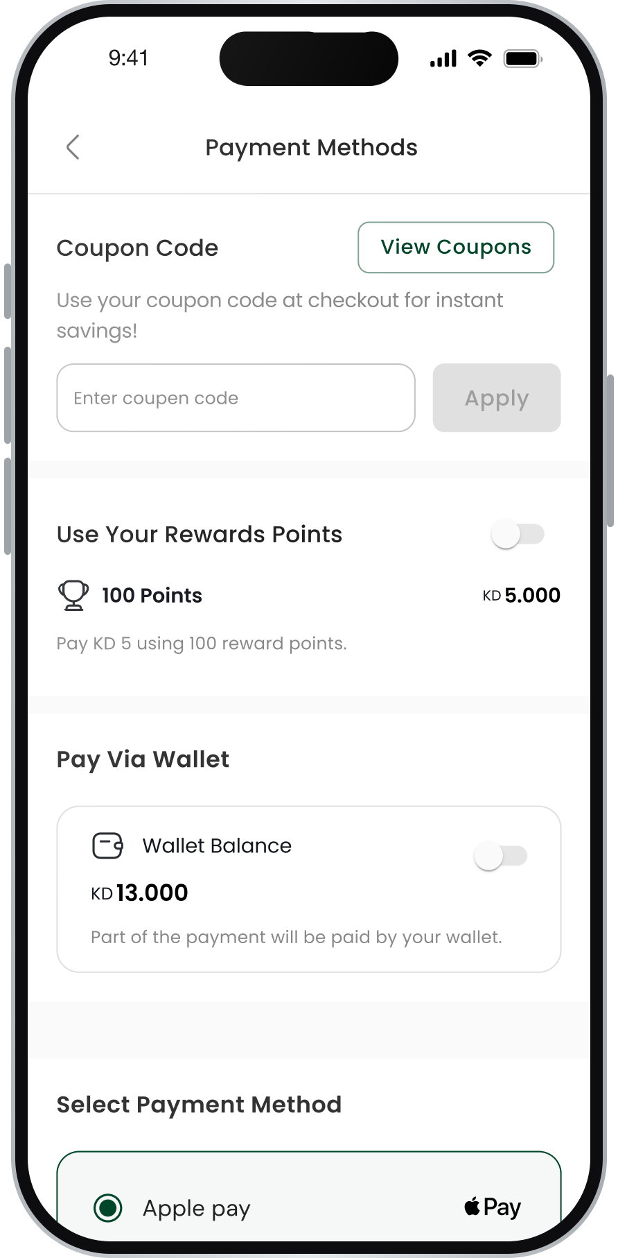
about 1.9 screens
In production Knet stays the default. Apple Pay is shown selected as a sample state for the development team.
| Change | Principle | Fixes |
|---|---|---|
| Two steps: delivery, then payment | Chunking · Goal gradient | Lost in the scroll |
| Delivery options under each parcel, with a selected state | Proximity · Visibility of status | Delivery missed for a parcel |
| Continue to pay checks every parcel first | Error prevention | Pay tapped too early |
| Payment methods as equal cards with logos | Recognition over recall · Status quo bias | Searching for payment |
| Coupon at the top of the payment step | Salience · Serial position effect | Coupon not found |
| Fees, points and wallet in KD before Pay | Ambiguity aversion · Loss aversion | Unclear final price |
04 · The result, Test
We compared the same measures before and after release: the event on the Pay button, and Clarity recordings.
Per 100 shoppers at checkout
Index, before = 100
36 of 100
shoppers tapped Pay after release
Up from 19 before, +89%
−78%
errors at Pay
Fewer taps on Pay with details missing
74%
of Pay taps succeeded before release
14 of 19 · success after release is the next measure
05 · What I learned, Reflection
Three lessons I carry into every project.
The Pay event showed the drop. Clarity showed the scrolling, the missed parcel and the search for a payment method.
People skipped what they could not see. Putting each choice next to what it affects did more than any warning.
The content barely changed. The order and grouping of decisions did most of the work.