01 · Familiar products don’t need a detail page
Grocery shoppers rebuy the same things. For them the detail page added steps, not information.
Case study 03 · NatureLand · Product card
Problem
Every action on a product card needed a trip to the detail page, so carts held only 4 products on average.
Approach
I walked through every task from the list, counted the steps, and compared three card concepts by how many shopper needs they covered.
Result
One card with five states. Shoppers added almost three times as many products, without leaving the list.

4 → 11
SKUs added to cart, on average
Before and after the new card
+175%
more products per cart
Relative change, about 2.7×
1 tap
to add a product
Instead of a trip to the detail page and back
5 states
one card for every situation
Add, added, edit, notify, notified
01 · The problem, Context · Empathize · Define
On Natureland, product lists are where shopping happens: dairy, bakery, fruit, household. The old card showed an image, a name and a price, and nothing else. To add a product, change the amount or ask to hear when it was back in stock, shoppers had to open the detail page.
0 actions
on the old card
Apart from opening the product
~4 steps
to add one product
Open it, add, go back, find your place
4 SKUs
added to cart on average
Before the new card
Every action cost a detour. The longer the shopping list, the more detours, so people stopped early.
| Task | Where it happened · steps | What shoppers need |
|---|---|---|
| Add a product | Detail page only · ~4 steps | A fast add for familiar products |
| Change the amount | Detail page or cart · 3–4 steps | Edit without leaving the list |
| Know what is in the cart | Cart only · 2 steps | See it next to each product |
| Hear when it is back | Detail page only · ~4 steps | Ask once, right where the product is |
| Save a favourite | Card, faint heart · 1 step | A clear saved state |
Grocery shoppers rebuy the same things. For them the detail page added steps, not information.
Going back meant finding your place again, so each extra product felt like work.
Shoppers had to remember what they had added, or open the cart to check.
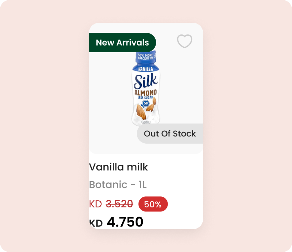
The card said “Out of stock” and stopped. Asking for an alert took another trip.
02 · The approach, Define · Ideate
I traced each pattern to how people decide, then compared three card concepts by how many of the four shopper needs they covered: a fast add, editing the amount, seeing what is in the cart, and a next step when a product is out of stock.
How might we let shoppers add, change and track products in one tap, without leaving the list?
How might we turn an out-of-stock product from a dead end into a next step?
| Observed | What was happening | Principle |
|---|---|---|
| Small carts | Every add cost a detour, so the effort grew with each product. | Interaction cost · Fogg Behaviour Model |
| Losing your place | Leaving the list broke the shopping flow. | Context switching · Flow |
| Not knowing what’s in the cart | The list gave no feedback about added products. | Visibility of status · Recognition over recall |
| Out of stock = stop | There was no next step, so the intent was lost. | Dead end · Goal abandonment |
| Unclear saved state | A faint heart didn’t show whether a product was saved. | Visibility of status |
Option A
A bigger Add to cart button on the detail page. Easy to build, but every action still needs a detour.
Covers 0 of 4
Option B
Always show − 1 +. Fast, but it crowds every card and makes the list noisy before anyone adds anything.
Covers 3 of 4
Option C
Start with a single +. After the first tap, show the count, and tap it to edit. Out of stock switches to Notify me.
Chosen · covers 4 of 4
03 · What we did, Prototype
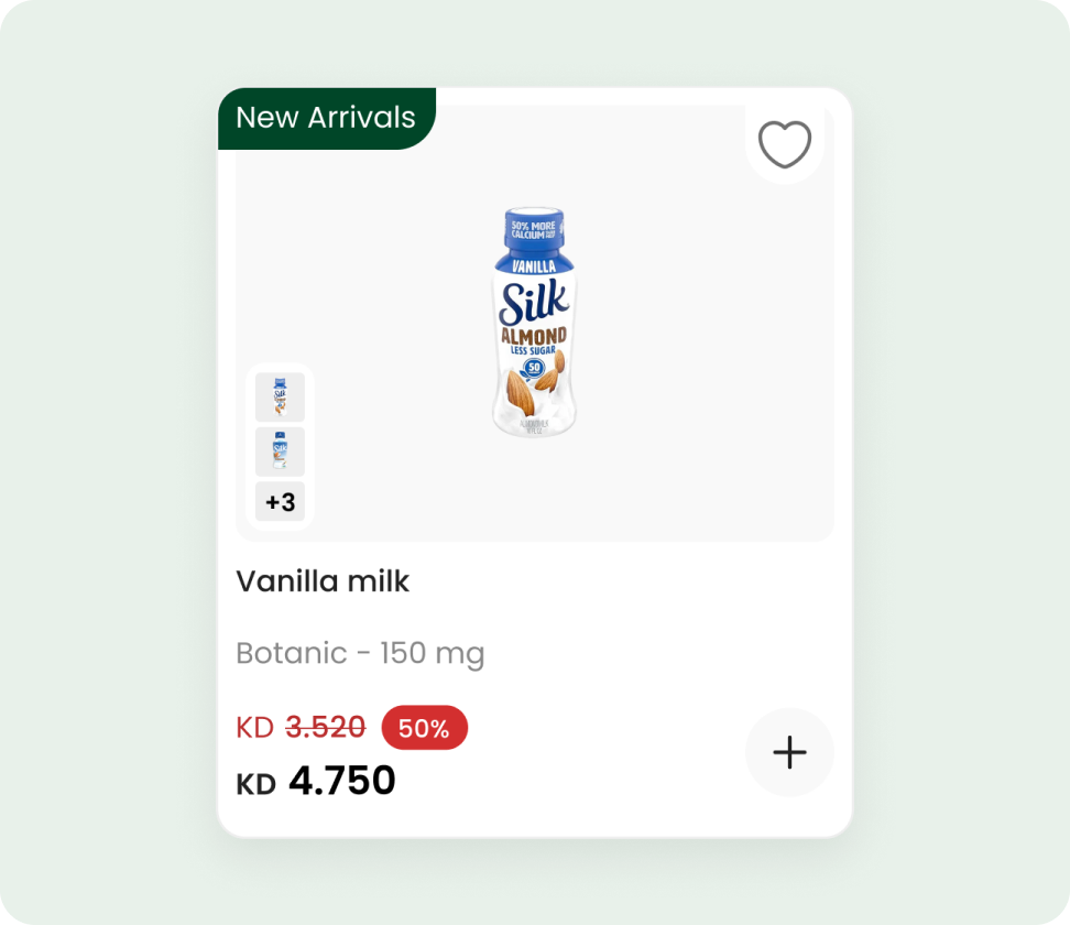
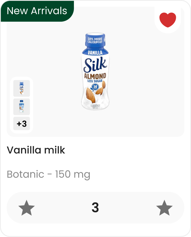
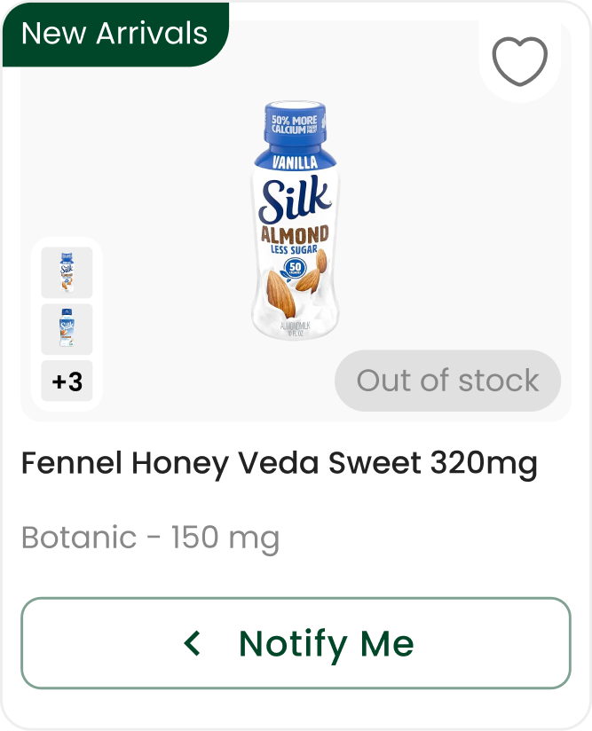
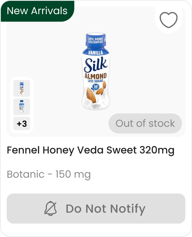
Each state answers one question a shopper has: can I add it, is it in my cart, how many, and what if it’s gone?
State 1
+ next to the price. One tap adds one item.
Fitts’s law · Low effort
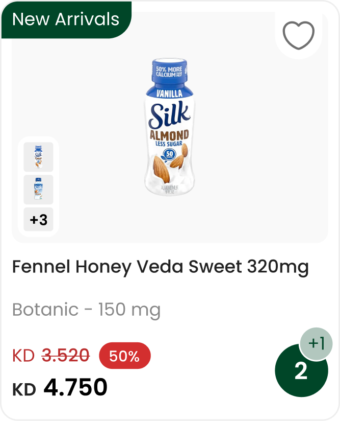
State 2
The button shows the count, so shoppers see what is in the cart from the list.
Visibility of status
State 3
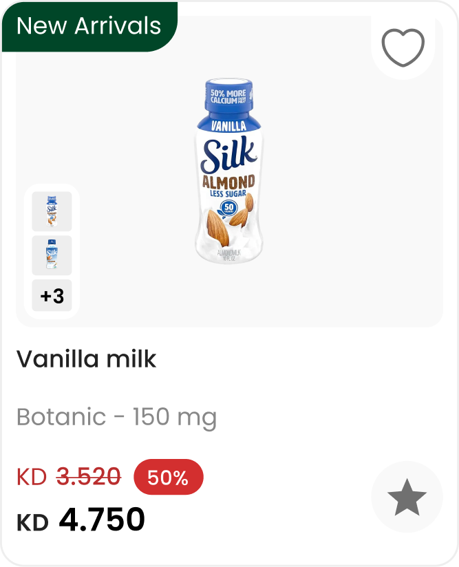
Tap the count to open − 3 +. A saved product shows a filled heart.
Feedback · Reversible
State 4
Notify me replaces the dead end with a next step.
No dead ends
State 5
The alert is set, and can be turned off from the same place.
Progressive disclosure
| Change | Principle | Fixes |
|---|---|---|
| + on the card | Fogg Behaviour Model · Fitts’s law | A detour to add |
| The count on the button | Visibility of status · Recognition over recall | Not knowing what’s in the cart |
| A stepper after the first add | Progressive disclosure · Flow | A detour to change the amount |
| Notify me on the card | No dead ends · Zeigarnik effect | Out of stock = stop |
| A clear heart and a cleaner image | Visibility of status · Aesthetic-usability | An unclear saved state, a busy card |
Every speed gain moved something else.
| Decision | Gained · gave up | How we handled it |
|---|---|---|
| Add from the card | One tap instead of a detour · fewer detail page visits, so less exposure to details, variants and subscription | Tapping the image or name still opens the detail page |
| + first, stepper later | A calm, scannable list · changing the amount takes one extra tap | The count shows at once, and one tap opens the stepper |
| Fast add | More products per cart · a higher chance of adding by mistake | The count gives instant feedback, and − undoes it on the spot |
| A bigger card | A clearer image and action · fewer products per screen | Tight white space and one action per state |
| No price when out of stock | Works within a technical limit · shoppers can’t check the price of a missing product | Notify me is the main action, so there is no dead end |
| More SKUs per cart | Bigger baskets · more SKUs doesn’t always mean more revenue | Order value and checkout rate are tracked next |
04 · The result, Test
We compared the average number of SKUs added to cart before and after the new card.
Average per cart · scale 0 to 12
11
SKUs added to cart, on average
Up from 4 with the old card
+175%
relative change
About 2.7× more products per cart
1 tap
to add, edit or ask for an alert
All from the list, no detours
05 · What I learned, Reflection
Three lessons I carry into every project.
Shoppers decide on the list, not on the detail page. Moving the action there changed behaviour more than any visual polish.
A card that ends in “Out of stock” loses the shopper. One button kept the intent alive.
Seeing the count after each tap made adding the next product feel easy.