Lost today · the transaction
The shopper with the highest intent left the funnel.
Case study 04 · Provin · Alternatives
Problem
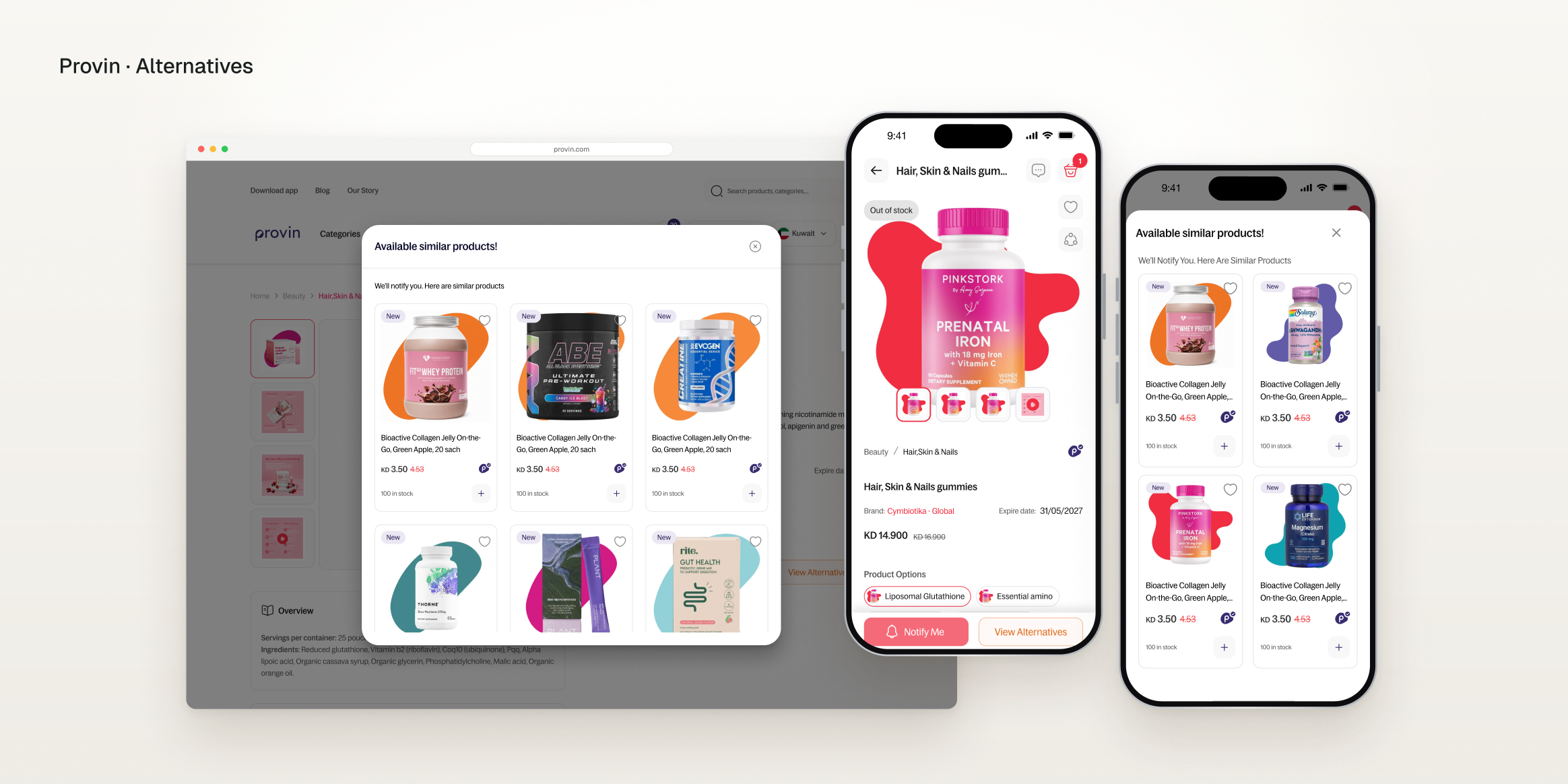
When a product ran out, shoppers had one option: Notify me — a dead end at the moment they most wanted to buy.
Approach
With no access to users and no A/B testing, I reframed the problem and added Alternatives next to Notify Me, validated with prototypes, guerrilla tests and a measurement plan.
Result
39% of shoppers who opened Alternatives added a substitute to cart — with no drop in Notify Me.
39%
added a substitute to cart
Of shoppers who opened Alternatives
No drop
in Notify Me clicks
Guardrail held over six months
≈ 2 : 1
Notify Me to Alternatives clicks
Both paths are used
0 A/B tests
needed to ship with confidence
Prototypes, guerrilla tests and a measurement plan
01 · The problem, Context · Discover
Provin is a curated supplements store in Kuwait. People take these products every day and come back every month, so running out breaks a routine, not just a basket.
The shopper with the highest intent left the funnel, at the moment they most wanted to buy.
The shopper with the highest intent left the funnel.
A broken routine weakens the monthly return.
The need gets met somewhere else.
Two hard limits shaped the method. I treated them as design constraints, not as a reason to skip research.
Interviews and field research were not possible.
Not enough traffic or infrastructure in production.
Desk research, rapid prototypes, guerrilla tests and a pre-launch measurement plan.
| Source | Finding | So what |
|---|---|---|
| Competitor review · xfix.ai, Straight North | Notify as the main CTA, related alternatives at first glance | A proven pattern to start from |
| Baymard (via EcomHint) | A good alternative meets the same need, not just any in-stock item | Defines the quality bar |
| StoreBeep | Back-in-stock emails convert at about 22% | Notify Me is worth protecting |
| Internal analytics | Out-of-stock status by category, and drop-off on out-of-stock pages | Sized the problem |
02 · The approach, Define · Develop
The team wanted to improve Notify Me. The data pointed to a different problem.
“Make Notify Me better.”
“At the moment of no, we have no yes path.”
“When my routine product is out of stock, I want the fastest way to cover the same need without breaking my routine.”
“I want to be the first to know when the original product is back.”
The two jobs run in parallel. Neither replaces the other, so the design needs two actions side by side.
…give shoppers who need it today a way to buy at the moment of out-of-stock, without losing the ones loyal to that exact product?
I weighed each option against both jobs and against risks we could not test.
The primary job, buying today, stays unanswered.
Risks losing loyal shoppers and demand data — and we could not test it.
Shoppers also meet out-of-stock in lists and search, so the session is lost early.
Covers both jobs with no extra navigation.
03 · What we did, Develop · Deliver
Notify Me keeps its usual place. Alternatives sits next to it as a clear secondary action, never a small lost link.
Other size, flavour or format in stock.
Similar form and dose.
Always shown with a “why this” flag.
A weak suggestion is worse than none.
The shopper never gets a surprise.
Safety comes before conversion.
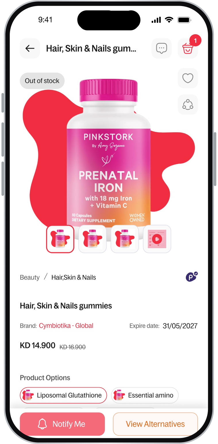
Clear status first, Notify Me in its usual place, View Alternatives right next to it.
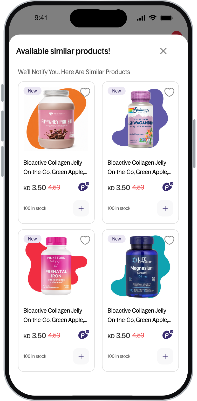
Opens in place: “We’ll notify you. Here are similar products.”
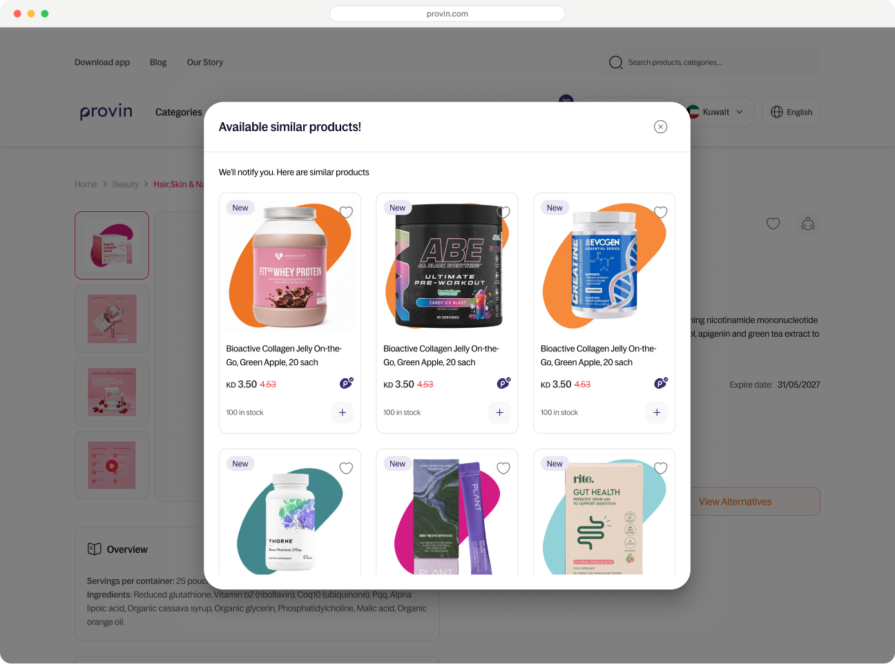
The same two actions on desktop; Alternatives opens “Available similar products!” over the page.
Figma for the design, Lovable for a clickable build. 5 to 7 colleagues outside the product team, one-on-one, 15 to 20 minutes, think-aloud.
| Task | Scenario | Success looks like |
|---|---|---|
| 1 | Dead end on the magnesium product page | Sees both actions unaided and can say how they differ |
| 2 | “I want it today” | Alternatives → pick one → add to cart, without going back to home or search |
| 3 | Alternatives on a card (sleep support) | Reaches alternatives without opening the product page, list context kept |
| 4 | “Only this exact product” | Picks Notify Me and does not feel it was demoted |
| 5 | Edge case: no defensible alternative | Does not look for a button that is not there |
| 6 | Synthesis: buying creatine | Both paths appear in their own story |
| Finding | What I changed | Why it matters |
|---|---|---|
| An icon-only button was unclear | Added a text label | The action is understood at a glance |
| Suggestions felt like a hard sell | Added “why this was suggested” | Trust in the substitute |
| Nobody read Notify Me as removed | Kept its visual weight | Loyal shoppers are not demoted |
| Event | Trigger | Question it answers |
|---|---|---|
| oos_card_view / oos_pdp_view | Seeing an out-of-stock card or product page | How often do shoppers meet out-of-stock? |
| notify_click / notify_submit | Using Notify Me | Does the Notify hierarchy still work? |
| alternatives_click (card / pdp) | Clicking Alternatives, and where | Which surface gets more use? |
| alt_view / alt_click | Seeing or clicking an alternative | How appealing are the suggestions? |
| alt_atc / alt_purchase | Adding or buying an alternative | Core funnel metric |
| session_recovered | An out-of-stock shopper reaches the cart in the same session | North Star |
Share of out-of-stock shoppers who get back on the purchase path in the same session.
Out-of-stock to add-to-cart, Alternatives click-through and recovered revenue.
Notify Me must not drop — plus return-to-purchase after notify, and returns or cancellations of substitutes.
04 · The result, Six months after launch
Alternatives added a “yes” path without weakening the “wait” path.
Each dot is 1 of 100 shoppers who opened Alternatives.
Monthly, six months after launch.
39%
added a substitute to cart
Of shoppers who opened Alternatives
≈ 2 : 1
Notify Me to Alternatives clicks
Relative share only
No drop
in Notify Me
Six months after launch
39% means the matching logic worked: the same ingredient and dose, a reason for each suggestion, and no button when no good match existed.
Most shoppers stay loyal to their exact product and prefer to wait. Weakening Notify Me, as first planned, would have lost the largest group.
05 · What I learned, Reflection
The question is how to build the most confidence with the tools you have.
No users and no A/B test changed how I researched, not whether I did.
Lovable let us test the concept in days, not weeks, and made handoff cleaner.
Guerrilla tests show it is seen and understood. Only launch data shows people buy.
We could not prove weakening Notify Me was safe, so we didn’t touch it.