01 · Clarity and data analysis
Session recordings and funnel data for the debt list and both activation entry points: the menu and the wallet top-up page.
Case study 04 · iTOLL · Direct debit
Problem
Direct debit lets people pay in one tap, but only 1 in 10 who started activation finished it.
Approach
Data showed where people left, and 72 phone calls showed why. So we explained before asking, and framed it as wallet auto-pay.
Result
By the end of the quarter, activation went from 10% to 22% — more than twice as many people finished.
10% → 22%
direct debit activation rate
Before and at the end of the quarter · +12 points
2.2×
more users finishing activation
Relative change
68%
of test activations came from Plan A
Curated, clearer copy · A/B test, 14,000 users
2.5×
wallet auto-pay vs direct debit
127 vs 50 activations, 500 users each
01 · The problem, Context · Empathize
iTOLL brings car payments into one app: debts, tolls and insurance. Direct debit lets it take a payment straight from a bank account, with no bank gateway each time. To turn it on, users sign a contract and add their bank card once, on the bank’s Faraboom platform. Most people who started never finished.
~10%
of users who started activation finished it
Before the redesign
~5%
of debt-list payers activated and paid
Users paying a debt or toll from the debt list
2 drop-off points
where people left
The amount and limit page, and the Faraboom bank platform
The flow asked for bank access before people understood what they were agreeing to, then sent them out of the app.
Session recordings and funnel data for the debt list and both activation entry points: the menu and the wallet top-up page.
72 calls over 10 days with users who dropped that day or had cancelled their contract. 43 calls were completed.
The flow reviewed against UX principles and best practices.
Worried about giving access to a bank account · didn’t trust the method · afraid the account could be hacked or emptied · thought it might be a scam.
Form errors while entering details · problems receiving the code · account issues.
Saw it as just another gateway · someone else turned it on for them · didn’t see how it differs from wallet top-up.
| Pain | Gain | |
|---|---|---|
| Slow payment methods | Fast, easy payment | |
| Typing card details every time | Safe payment | |
| Distrust of the activation flow | Trust in the direct debit flow | |
| Fear of not being able to cancel | An easy way to cancel |
02 · The approach, Define · Ideate
I turned the research into an empathy map and a journey map, reviewed the flow against UX principles, and traced every pattern to how people decide. Then the team generated ideas together, and I benchmarked how other products introduce a stored payment method.
How might we explain direct debit so people understand and trust it, before we ask for bank access?
How might we make activation short and error-free, so that starting it means finishing it?
| Principle | Issue | Fix |
|---|---|---|
| Visibility of status | Activation status, date and contract length weren’t shown | Show status, activation date and transactions |
| Error prevention | Our VPN breaks the bank step; supported banks only show inside the input | Warn about VPN first; show supported banks up front |
| Help users recover from errors | Direct debit looked like a gateway in the debt list | Clear micro-copy; wallet auto-charge instead |
| Aesthetic and minimalist design | Onboarding was a wall of text that nobody read | Onboarding with micro-copy and images |
| Help and documentation | Users didn’t know how much was taken, or why | Show each transaction with its reason |
| Goal gradient | No sense of how many steps were left | Show the activation steps |
| Observed | What was happening | Principle |
|---|---|---|
| Distrust of bank access | An unfamiliar method asked for account access up front | Ambiguity aversion · Loss aversion |
| Seen as just another gateway | Direct debit sat in the debt list like any payment method | Mental models |
| Dropping at the limit page | Amount and limit were asked before the value was clear | Cognitive load |
| Errors on Faraboom | No warning before leaving the app (VPN, supported banks) | Error prevention |
| Not knowing how far along | No steps or status shown | Goal gradient · Visibility of status |
How products we and our users know introduce a stored payment method.
03 · What we did, Design
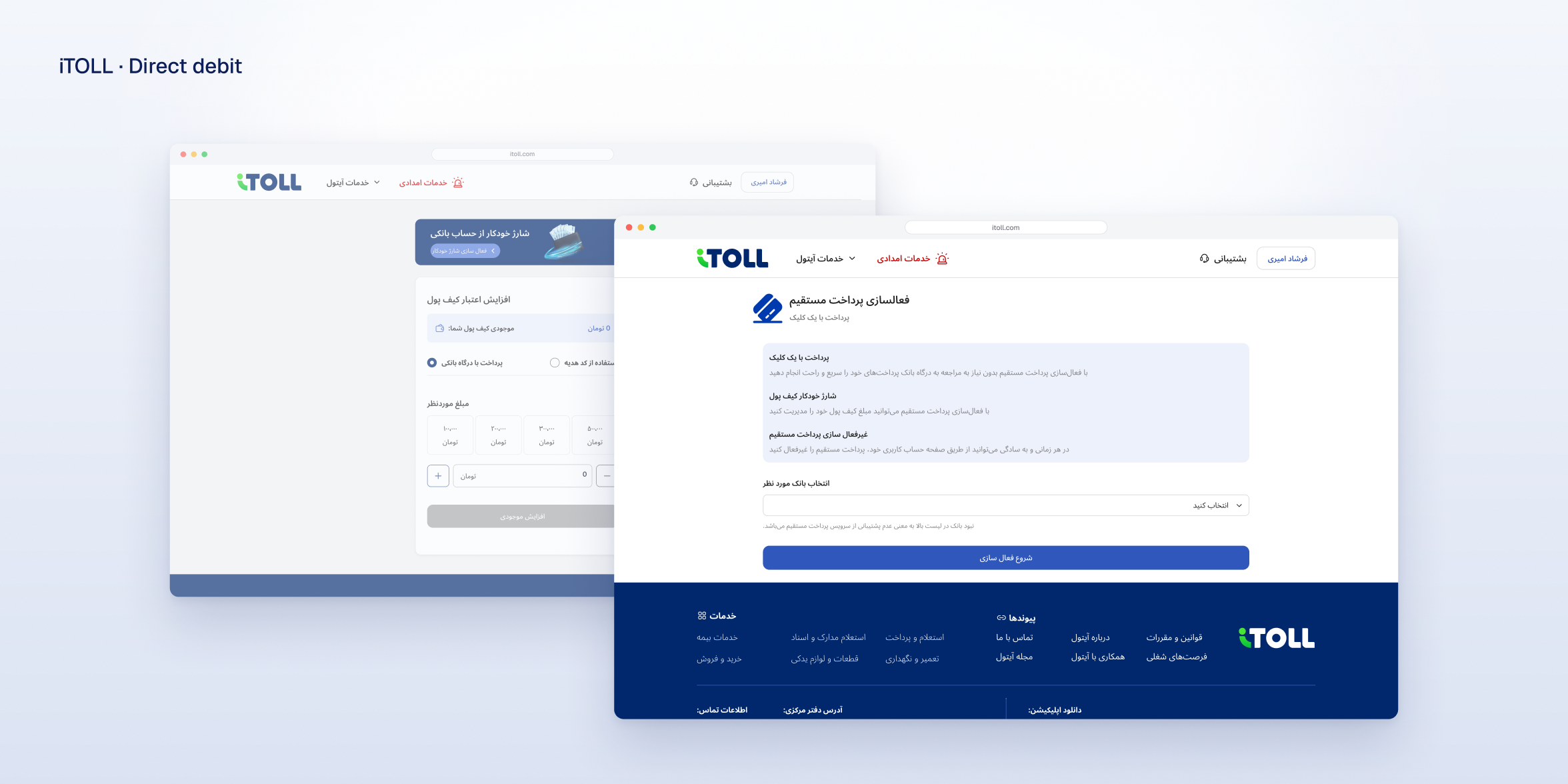
The redesign leads with a familiar idea, wallet auto top-up, and explains direct debit in plain words before asking for any bank details.
Screens shown in Persian, as shipped.
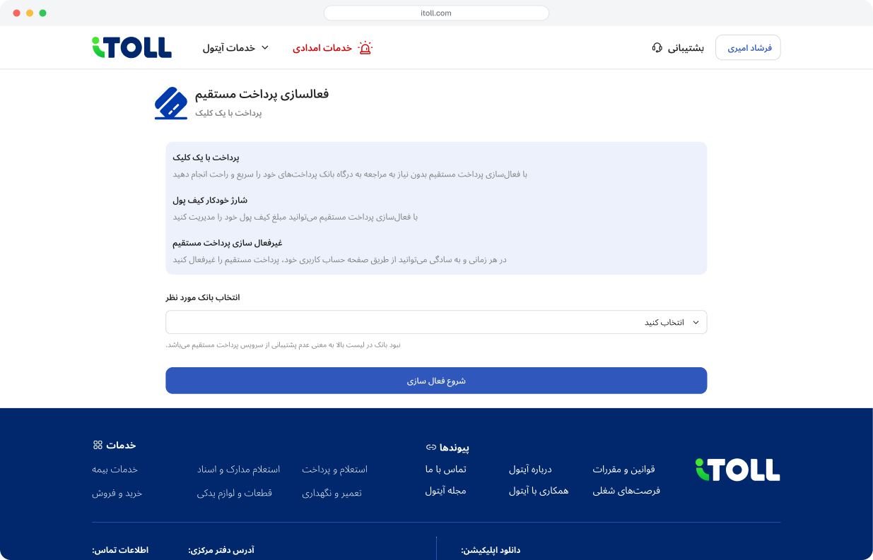
Three benefits in plain words — pay in one click, automatic wallet top-up, turn it off any time — then choose your bank.
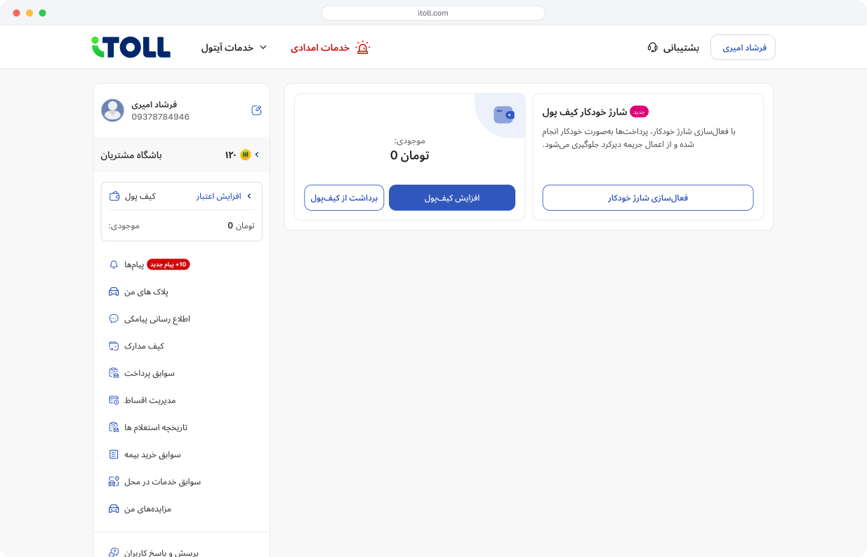
Wallet balance, top-up and direct debit, managed from the user account.
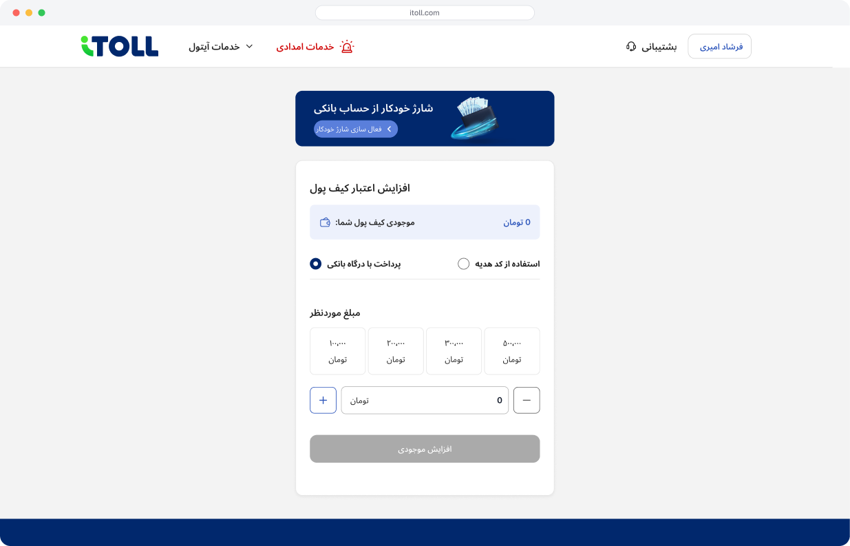
Automatic top-up from a bank account, powered by direct debit.
| Change | Principle | Fixes |
|---|---|---|
| Hide direct debit in the debt list until it’s active | Mental models · Choice overload | Seen as just another gateway |
| Wallet auto top-up instead of direct debit | Framing effect | Distrust of bank access |
| Rewritten, clearer copy | Ambiguity aversion | Not knowing direct debit |
| VPN warning before Faraboom | Error prevention | Errors on the bank platform |
| Onboarding page | Aesthetic and minimalist design | A wall of text nobody read |
| Direct debit as a top-up method | Recognition over recall | Not seeing how it differs from top-up |
| Decision | Gained · gave up | How we handled it |
|---|---|---|
| Ship 6 of 9 ideas | Delivered within time and tech limits · contract settings and the transaction list waited | Planned as next steps |
| Lead with wallet auto-pay | 2.5× more activations on the landing page · direct debit itself is less visible | It still powers auto top-up behind the scenes |
| Hide direct debit until it’s active | Less confusion when paying · fewer chances to discover it in the debt list | Discovery moved to the wallet and onboarding |
| Curated copy (Plan A) | More trust, 68% of activations · less detail on screen | Only the key points, under clear headings |
| VPN warning before Faraboom | Fewer failed activations · one more message in the flow | Shown only at the hand-off step |
04 · The result, Test
We ran two A/B tests: first what to say, then how to frame the feature.
Google Optimize · 14,000 users who entered wallet auto top-up with direct debit. Same flow, different copy.
Toll landing page · 500 users per option. Same capability, framed two ways.
10% → 22%
direct debit activation rate
Before, and at the end of the quarter
68%
of test activations came from Plan A
More than twice Plan B’s share
2.5×
more activations with wallet auto-pay framing
127 vs 50, 500 users each
Understanding came before bank access, so the request felt fair. Clear, selected copy removed the unknowns that made people say no. · Ambiguity aversion
Wallet auto top-up is a known idea, so direct debit stopped looking like a strange new gateway. The same feature drew 2.5× more activations. · Framing effect
“Turn it off any time” lowered the felt risk, and the VPN and bank warning before Faraboom prevented errors. · Loss aversion · Error prevention
Hiding an option people hadn’t set up made paying simpler, and showing the steps made the end feel close. · Choice overload · Goal gradient
05 · What I learned, Reflection
Three lessons I carry into every project.
People didn’t reject direct debit. They rejected what they didn’t understand. Copy moved the number more than layout.
The same feature, called wallet auto-pay, was chosen 2.5× more often.
Talking to users who dropped that same day explained what the data couldn’t.